


Want to delight your first-time visitors?
Above all, get to the point right away.
So with that in mind, this post has two parts:
- Things you should ALWAYS do.
- Things you should NEVER do.
6 Things You Should Always Do
1. Make the Landing Page Purpose Crystal Clear Obvious (& Relevant) to the Visitor
If you take only one thing from this post, it would be to ask this two-part question when you’re developing the creative and messaging for your landing page:
- How did the visitor get here?
- Why did they click on whatever link led them to the page?
There can be multiple answers to each question.
For example, as far as “how” is concerned, the same landing page may be used for a paid search, email, and an ad on Facebook.
In terms of “why”, it might be to check the price, learn more, check availability, see evidence that the product/solution meets the specific visitor’s need, etc.
Remember that some part of the creative/copy in the referral source (ad, email, link, meta description, etc.) made a promise.
The anticipation of seeing that promise fulfilled led to a click. That click led the visitor to the landing page in order to see that promise met.
Did you meet it?
To get this part right:
- Review the referral source (again, the ad, the email, the link, the meta description, etc.) and note the promises made.
- Now review the landing page and make sure that it delivers on all of those promises made prior to the click. If not, the referral source is promising too much or the landing page is under-delivering. Either way, this is where you fix it.
Important note: Succeeding in making the landing page crystal clear to the visitor may sometimes result in a quick exit. Most likely, you’re not a fit for that visitor so at the very least you didn’t waste their time which they’ll (at least subconsciously) appreciate.
2. Load Quickly
This one should be obvious. Slow loading pages will destroy the experience for the visitor and you will likely not recover.
There are plenty of other options available and the visitor knows it.
Load quickly and the visitor will be delighted at the near-instant access.
3. Display Properly
File this one also under the category of “obvious”.
Visitors will be happy when you reduce friction – and delighted when you take it away.
A page the doesn’t display properly on whatever device the visitor happens to be using means a high level of friction that will likely kill any chance of a conversion.
Don’t worry if it doesn’t show properly on an iPhone 4 (released in 2010 so it’s well past time for that user to upgrade), but as a general practice, I always test backward compatibility for whatever operating systems were widely used during the past three years.
4. Provide Reassurance to the First-Time Visitor
Remember that time you clicked on a link, went to a page, and just had a gut feeling you’re in the wrong place?
Either you didn’t immediately see what you thought you were there for or the site looked sketchy. Chances are you were less than delighted and didn’t stick around long.
On the flip side, there was probably another time you clicked on a link to a page you’ve never been to before and you immediately knew you were in the right place. This page:
- Had exactly what you were looking for.
- Did NOT look to be the least bit sketchy.
To reassure that first-time visitor, here are a few things that will always help:
- Crystal clear relevance to the visitor intent (see point #1).
- Speak directly to whatever the visitor hopes to achieve by looking at your product.
- Key trust elements present on the page (testimonials, reviews, security, privacy links, history, etc.).
- Minimal interference pop-ups.
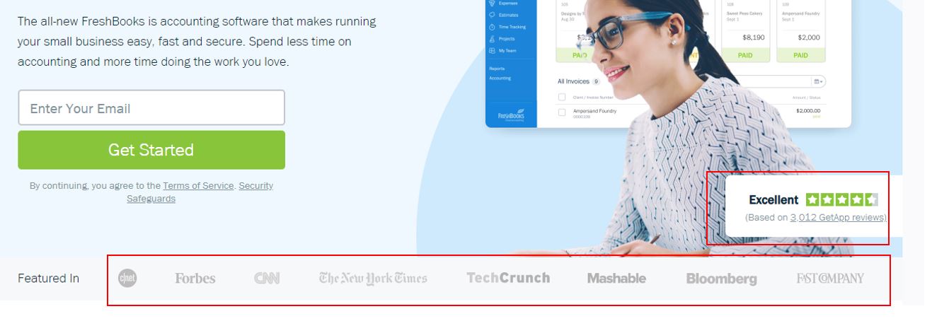 Here’s an example of key trust elements on a page. This provides reassurance to the visitor that the product is legit and worth a look.
5. Communicate to the Visitor’s Emotional Need Before the Rational Part of Their Brain
Countless marketing experts advocate the importance of speaking to the emotional part of the brain over the rational, logical part.
That’s not to say that you shouldn’t be speaking to both (because you should), but the key elements that stand out on your page (headline, image, first 10 seconds of video), need to trigger an emotion, Then the visitor will be open to the rational sales pitch.
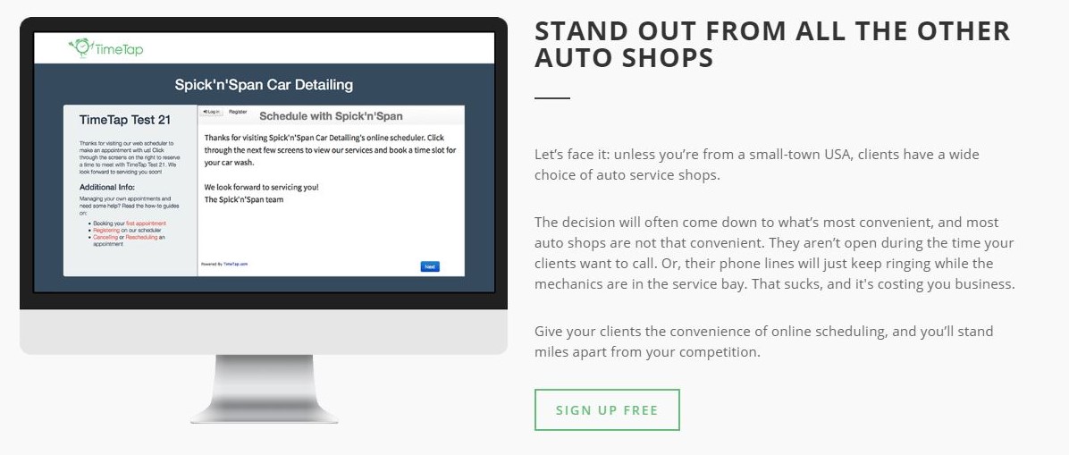
For example, below is a B2B Software as a Service (SaaS) that lets auto repair shops offer easy and accurate online scheduling for service.
 Software for auto shop scheduling
Note the two headlines.
They’re nothing fancy or particularly clever here, but they state the obvious and trigger a positive emotion (most likely “interest” or “hope”) by solving two issues every small, independent auto repair shop face:
- Informing customers when there is shop availability without tying up a resource on the phone and making a customer hold.
- Letting customers schedule service easily and painlessly.
Once the emotion is triggered, then the page visitor is open to finding out more.
In other words, the rational part of the brain is now ready to take a closer look.
 Software for auto shop scheduling
6. Provide Clear & Relevant Navigation Links
There’s no need to clutter a landing page with every possible piece of relevant information that a visitor would possibly need.
In fact – don’t do that – you’ll end up with a cluttered page that tries to be everything to every possible segment. Instead, just make it easy for visitors to find what they’re looking for.
Examples of relevant navigation can include:
- Image gallery
- Specifications
- Related products and accessories
- Reviews
- Q&A
- Links to educational content
- Help links
- Clarity on who the product or service is meant for
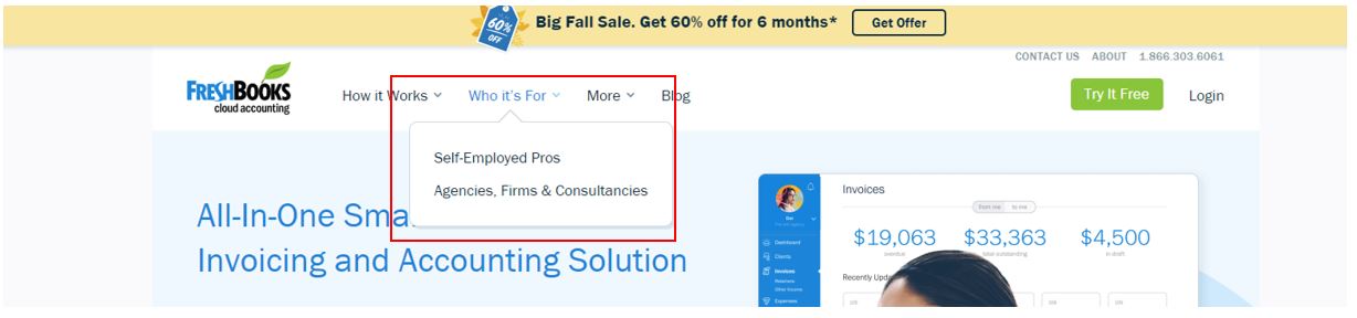 Simple, helpful, obvious navigation links tell the visitor exactly who the product is meant for
4 Things You Should Never Do
Use the list above as a checklist, but you will definitely not delight your visitors if any of the following conditions exist on your page:
1. Ads Aren’t Just Present… They Take Control of Your Experience
We’ve all been to this kind of a site.
It’s maddening.
You start reading or viewing a piece of content and all of a sudden the most intrusive, annoying popup takes over the page and forces you to either view it, click out of it, or click on it (deceptively), or lose your place on the page.
This is not an “anti-advertising” point at all (Actually, I make my living running ad programs!).
Advertising certainly has its place on the web – something has to pay the cost of producing the content we all love to consume.
In some cases, that means ads.
This is, however, an “anti-over-intrusive, annoying, irritative, deceptive advertising” point.
Once you get to the landing page, the content is nearly taken over by ads and internal links:
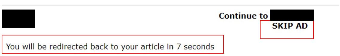 Does anyone actually not click on the “Skip” link?
Once you get to the landing page, the content is nearly taken over by ads and internal links:
 This may get email signups or link clicks, but it does not delight the visitor.
2. Do Not Immediately Put an Obstacle or Distraction That Offers No Value to the Visitor
Many sites provide a pop-up distraction to the visitor. That’s not uncommon and it’s perfectly fine as long as it provides real value (and in some cases, may even delight them).
Examples of this include:
- Discount or free ad on in exchange for email signup.
- Information about an upcoming event.
- Helpful chat window.
Things that add zero value include:
Getting the Timing Wrong
This makes popups that may otherwise provide value but don’t simply because they launch at the wrong time. They’ll either come across as too aggressive or irrelevant thanks to timing.
Examples of this could include satisfaction surveys (before the visitor even has time to view the page), an offer for a free download or trial (again, before the visitor even has had a chance to look at the page).
A Video on Auto-Play with the Sound On
Gets attention for sure, but usually not in a good way.
3. Do Not Require Some Type of Plugin Just to View the Content
I honestly can’t believe I still have to give this advice, but there are still sites that have not been updated for devices that have been around since 2007.
If your site hasn’t been updated since before the last recession (2008), it’s way past time.
Flash is dead.
4. Drive Potential Customers to a Page with a Discontinued Product
This one should be obvious, but it happens all the time – usually by accident.
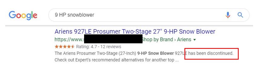 Note that a discontinued product still shows up in a query.
The link in the search result leads to:
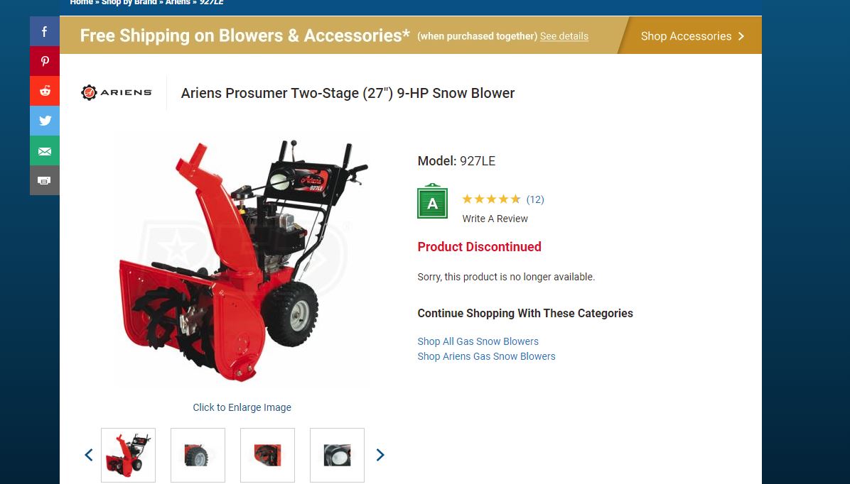 Product page for a discontinued product still active.
This can easily happen on large catalog sites unless you stay ahead of it.
To their credit, they do provide category links on the page, but it would be better if the visitor could’ve just been driven to a page in the first place with a currently available product.
The query [9 HP snowblower] was fairly generic and there are plenty of 9 HP snowblowers manufactured and in inventory.
Bottom Line
Before even building a landing page, ask yourself (or your team) the following simple questions:
- Why is the visitor landing on your page?
- What would they be looking for believing it can be found on your page?
- What must we provide that will make them believe they’re exactly where they want to be once they land on our page?
More Resources:
- 11 Ways to Increase User Engagement & Why It Matters for SEO
- How to Reduce Your Bounce Rate: 20 Tips That Work
- How to Use User Behavior Analytics to Increase Your Conversions: 5 Tips
Image Credits
All screenshots taken by author, October 2019
