


A lot of marketing experts will tell you that SEO is the driving force behind conversions.
I’m here to tell you it’s not.
SEO can only do so much. You can spend a million dollars on your SEO campaign and rank at the top of Google’s search results for all of your keywords, but if people don’t convert, then your SEO efforts are ultimately worthless. You should, instead, start backwards and work on conversion rate optimization (CRO) before you even consider SEO. CRO is the process of optimizing your landing page to influence the most viewers to convert.
Think of it this way. SEO is the GPS that tells your viewers how to get to you, and CRO is the vehicle that gets them there. You can have a state-of-the-art GPS, but if your car is broken down, that GPS doesn’t help at all. It’s SEO that gets them to see your landing page, and the landing page is where they convert. Therefore, CRO is what ultimately affects your bottom line and is a web marketing MUST.
If your landing page is failing to convert visitors to customers, you’ll want to take the steps to ensure that your site becomes a more relevant, emotional, and interactive experience. Here are 12 CRO steps for improving your landing page and driving those conversions.
1. Understand Your Target Market
People don’t have the time or desire to read the hundreds of webpages they see every day. They only choose to view information that matters to them. Therefore, you need to really get to know your market so you can create relevant content.
You can familiarize yourself with your target audience by conducting surveys and interviews. Ask your interviewees questions that will reflect on these main points:
- What are the general demographics of people who will be interested in my product?
- What are these people using my product for?
- How does my product make people’s lives better?
- Do people consider any alternatives to my product? Why?
These questions help you uncover trends within your market and give you information on user intent, which analytics alone cannot provide. Using this information, you can then tailor your landing page to accommodate your target audience. This is crucial to increasing the likelihood that viewers will convert.
2. Establish Analytics
Analytics give you the full story on your landing page activity. They provide valuable insight on how people interact with your page, including how they found your site, what they clicked on once they got there, how long they stayed on each page.
This information can help you identify problems that users may be having on your site. Maybe people are leaving right away because your page takes too long to load. Or perhaps people aren’t converting because your call-to-action is too low on the page for people to find without having to scroll down.
You may have never known that you had these problem areas without analytics. Once you know, you can formulate the right solutions to make your landing page experience as easy and enjoyable as possible. Incorporating analytics into your landing page can save you time and money; instead of guessing at what to do next, you’ll have the research to guide you to make the right improvements the first time around.
3. Make Sure Your Messages Match
One of the biggest issues that analytics can identify is a message match problem. A message match problem occurs when viewers click on your ad, transfer to your landing page, and then quickly leave. This happens because your landing page doesn’t have the information that viewers expected when they clicked your ad.
A message match problem can doom your landing page to fail. If your ad and landing page don’t look and read similarly, it will throw your users off. They’ll land on your page and wonder where to find that offer they saw, or why your homepage doesn’t even feature the keyword that got them interested in the first place. They could feel like they were tricked, and as a result, they may trust you less.
You can avoid this dilemma altogether by creating ads that use the same language and images as your landing page. That way, there are no surprises when users get to your site.
4. Evaluate Your Landing Page’s First Impression
It only takes your brain 0.013 seconds to identify images, and 0.05 seconds for your visitors to form an opinion on your landing page. Their subconscious opinion will then influence every decision they make for the rest of their time on the page.
This is why it’s so important that your message match is strong. It’s also why you need to design your pages with user relevance and functionality in mind. Make sure that your pages are laid out in a way that is intuitive to your viewers, with the high quality images and well-written content that people expect to see from websites.
If any of these elements turn your users off, it becomes an uphill battle all the way to conversion. That means you have to make sure that the first images your viewers see pack a punch and make the impression you want to make.
5. Make Your Page Emotional
This goes hand in hand with your first impression. First impressions start the experience by ensuring that everything meets user standards and is in a familiar location. Emotional elements then create a mood, entice the visitor and draw them deeper into your site.
Your first step is to identify which emotion you want your viewers to experience while they’re on your page. Do you want them to feel relaxed, horrified, or sympathetic? Are you going for some kind of shock factor? Maybe you want your visitors to feel so angry or disgusted by a current social situation so they are forced to take action. Take the following landing page 12 Keys Rehab Center (an easy industry to pull on heartstrings), in which the rehab facility capitalizes on the hopes of potential clients who dream of running away from their problems through an alternative path: “The path to freedom”.
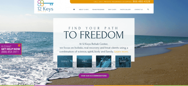 Screenshot Taken: 2/13/2014 of www.12keysrehab.com.
Once you’ve picked the mood of your page, figure out ways to lace it throughout all of your content. Consider how you can incorporate the appropriate emotional triggers into your color scheme, fonts, images, and body copy. How each element supports the other is what determines the overall mood of your page.
6. Craft a Clear & Compelling Offer
Once viewers have a good first impression and feel emotionally connected to your landing page, their next step is to decide if your offer is worth reading. Research shows that the first thing they’ll be looking for is a prominent headline with relevant keywords. If they like what they see, they’ll go ahead and read further into your body copy.
However, most visitors don’t read top to bottom – they skim the headlines and only actually read the sections they care about. Therefore, you need to make sure that you convey your offer in your headlines, so visitors can absorb it based on the way they naturally view your content.
An excellent offer does the following:
- Addresses your customer and identifies their needs
- States what your product does and how it meets those needs
- Demonstrates what makes you unique from your competitors
Remember that your users already decided whether they like your page or not. Your only task now is to provide significant content and reinforce that their initial decision was right.
GrowthGiant knows a thing or two about conversion testing. It’s no wonder their landing page has a very clear message for their readers.
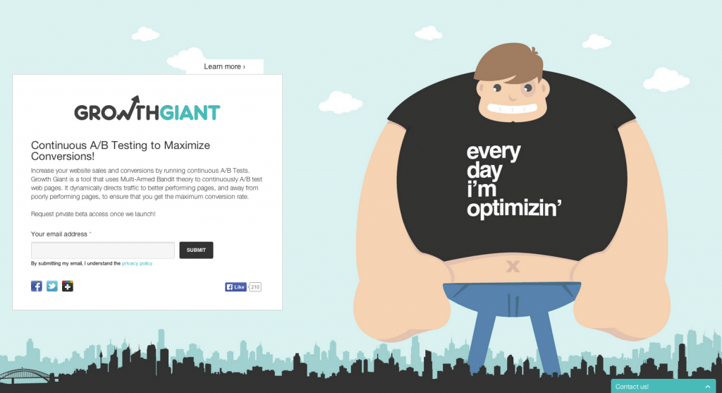 Screenshot Taken 2/13/2014 from growthgiant.com
7. Ensure that Your Images Reinforce Your Message
You can do this by choosing, designing, or capturing images that reinforce the mood of your page and speak directly to your target market. Ideally, your images do two things:
- Show a representation of your target audience
- Depict the emotional value of your product that users will get after they convert
For example, if your primary audience consists of women in their early 20s, you’ll miss the mark entirely if your images don’t have pictures of – you guessed it – women in their early 20s. People won’t buy a product if they can’t see themselves using it, and what better way to show them that than by incorporating pictures of people who look like them?
Also, make sure that your images show people enjoying the benefits of your product. This goes back to the emotional resonance on your page. People are much more likely to make that impulsive purchase if they feel a connection to the product. If you’re selling a prescription drug that will help people sleep at night, include pictures of people sleeping peacefully. If your product is a vacuum cleaner, show some pictures of nice, clean rooms in an orderly home. It seems like common sense, but you’d be surprised how often this simple strategy is overlooked.
Talk about capitalizing on Emotional Resonance and reinforcing your message, Havahart Wireless, a national retailer of animal products, prides itself on their relationship with our four-legged friends as well as a brand message that reinforces that passion with other animal lovers. This example of their social landing page pulls on the emotional connection we share with our pets and illustrates a happy pup roaming free in the outdoors. This reinforces that their product allows pets freedom to roam.
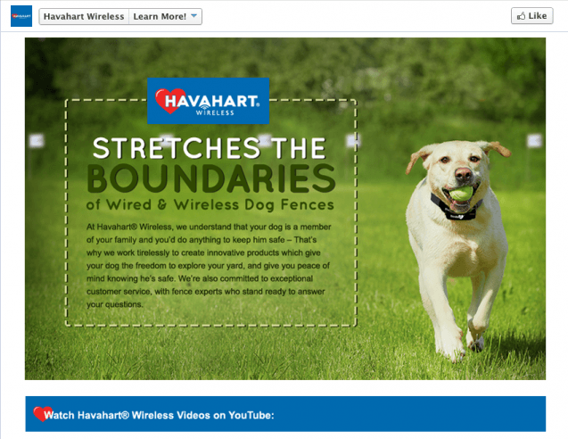 Screenshot Taken: 2/13/2014 from https://www.facebook.com/havahartwireless/app_756139017747557
8. Consider Creating an Explainer Video
This isn’t a one-size fits all strategy. The first thing you need to do is ask yourself if there is something unique about your service that you can’t easily communicate through static text or images. If your product is difficult to explain, requires demonstration or needs a little extra emotional appeal, you might benefit from incorporating a video that better explains your brand.
Statistics suggest that visitors are 64-85 percent more likely to convert because of video. However, there are a few factors you must consider to make your video successful:
Can your target audience watch video?
Your user’s immediate circumstances may determine that video isn’t an optimal communication tool. For example, if they work in a quiet office or have young children, playing audio may be difficult or forbidden. Age, poor Internet connection, or inadequate computer hardware may also deter your viewers from watching your video.
Does video really enhance the experience?
Your video should contribute something that your text or images do not. Whether it’s a demonstration, a testimonial, or an emotionally charged showcase of your brand, it should offer something unique to your user’s landing page experience so your viewer’s aren’t consuming the same information over and over again.
Is your video more substantial than just making the pitch?
Users have already decided to stay on your page and consume your content. You don’t have to pitch them anymore. Your task is now to provide the quality information they need to make that conversion.
Want a great example? Here’s how Crazy Egg does it.
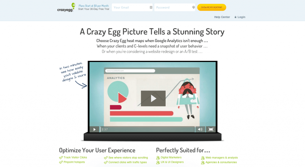 Screenshot Taken: 2/13/2014 from www.crazyegg.com
9. Incorporate Social Proof
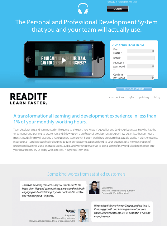 Screenshot taken: 2/13/2014 from readitfor.me
This is critical. According to psychology, people tend to gravitate to people, places, and things that reflect themselves. Therefore, you want your users to see “themselves” as much as possible on your site.
We talked about using images that look like the people in your primary audience, but you should also incorporate social media to help users see themselves on your page. Creating a social media feed will allow you to track mentions of your brand across the social sphere of the web. This includes social media mentions, testimonials and posts from high authority websites that are linking to your site. If a user sees positive reviews from people who are like them, or mentions on sites that they view as high authority, then they will be more receptive to your page.
Is it worth it? Yes. Research shows that 63 percent of consumers are more likely to purchase from a site that has product ratings and reviews. That’s a pretty big payout for setting up a small feed. Just think what you could do if that testimonial came from the head of Zappos. That’s what Read it For Me did.
10. Write Copy That Makes People Want to Read More
Once a visitor has been on your site for half a second, they’ve had all the time they need to process the visuals and determine if you’re trustworthy. Now, their conscious mind kicks in and they start really consuming the copy on your landing page.
Therefore, you want to give them high-quality content to keep them interested. It should communicate benefits and make them want to read more, but most importantly, it should reinforce the tone that you established with your visual elements. Basically, make sure that the images you see and the text that you read are a complimentary package deal.
11. Design Clear CTAs
Your landing page is one big interactive experience. It tells, shows, and reinforces your brand’s story. Your visitor has a problem and listens to your story, then determines if you can provide a solution.
If they decide that you can, they’ll look for your CTA. In order to ensure that they follow through, you need to make sure your CTA triggers a response and is designed in a way that it visually contrasts with the rest of the site and is visually significant.
If you do this, your CTA can contribute to your story. To your users, your CTA can act like a portal to the next chapter, where whatever problem they’re having doesn’t exist anymore. This example by Patten CAT illustrates how a strong CTA can get consumers exactly what they are looking for – rental equipment.
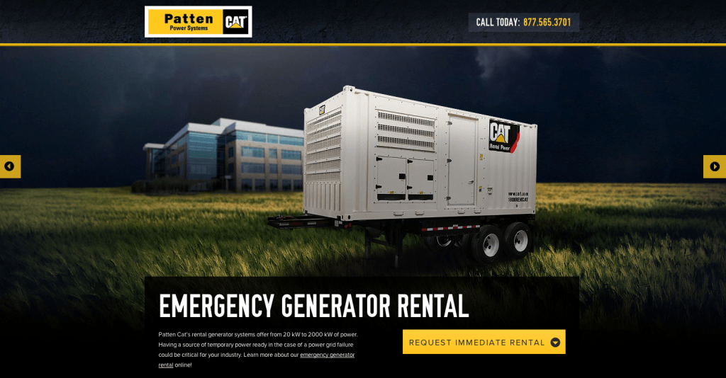 Screenshot Taken: 2/13/2014 from pattenpower.com
12. Start A/B Testing
There’s more than one way to design a great landing page that has all of the features listed above. You and your team will have numerous ideas for copy, design, images, and layout that all could suit your needs. Therefore, it is a good idea to create a document of all your ideas, test each one, and then compare your results. This way, you can collect data to determine and support your most profitable concepts.
Conclusion
CRO is the way to get your visitors to convert. Get to know your audience, and familiarize yourself with the problems they may be having on your website. Design your landing page so that it can addresses these problems in a way that’s easy to use and conveys a mood through content and visuals. Rework your CTAs so that they’re apparent and persuasive.
Let other people persuade your visitors for you by incorporating a social media feed on your site. Do some testing before you launch any changes so you can gather the data to support your improvements. These basic concepts will go a long way in boosting your conversion rates. Then you can worry about SEO.
Author has no affiliation to any examples listed.
