


Phantoms and Pirates, ohhhhh no! Pandas and Penguins, cute! Pigeons…ewww, gross! In the nomenclature of Google filters, algorithms, and updates, the last few years brought symbols we either love or fear.
This deep-dive data analysis will look at the local directory industry and why it continues to fly high after Google released the Pigeon update.
(Note: There was no official name for the July 24, 2014 update, so the name given by Search Engine Land stuck: “Pigeon is the name we decided on because this is a local search update and pigeons tend to fly back home.” The operative word was “tend,” as Pigeon never came back home for many unlucky websites.)
A major cause for introducing Pigeon may have been complaints from Yelp about poor ranking. There is also much to be said for Andrew Shotland’s theory that “Pigeon may just be Google’s way of saying that going to a local business’ website is not the best way to make a decision when you are in the initial research phase.”
In laying out findings, the intent here is to pass on techniques for search engine trend analysis to SEOs and content strategists. Techniques for evaluating a Google algorithm’s effects on a niche can be applied to how other effects specific to industries and sectors change their Google rankings.
1. Find Events to Correlate With Changes for Your Industry or Niche
Consider how to extend this research for your industry. For example, what do ranking changes based on news, cultural trends, seasonality, or big shake-ups for companies in your sector tell you?
All data below comes from SEMrush and graphs are from Tableau Public. Results come from historic information on the 40 million most popular keywords per month and associated metrics. It is the “most popular” characteristic that makes the historic data useful for sector, niche, or competitor research.
If we researched data from a year ago and “most popular” gave unequal weight to certain industries or entities, comparisons would not be accurate. A limitation of SEMrush data, though, is it logs search strictly from a national level, and excludes data in SERP that appear for searches from local IPs (Search Engine Metrics, for example, started looking at this data alongside Google’s Universal results).
2. Pull Historic Data and Analyze Results
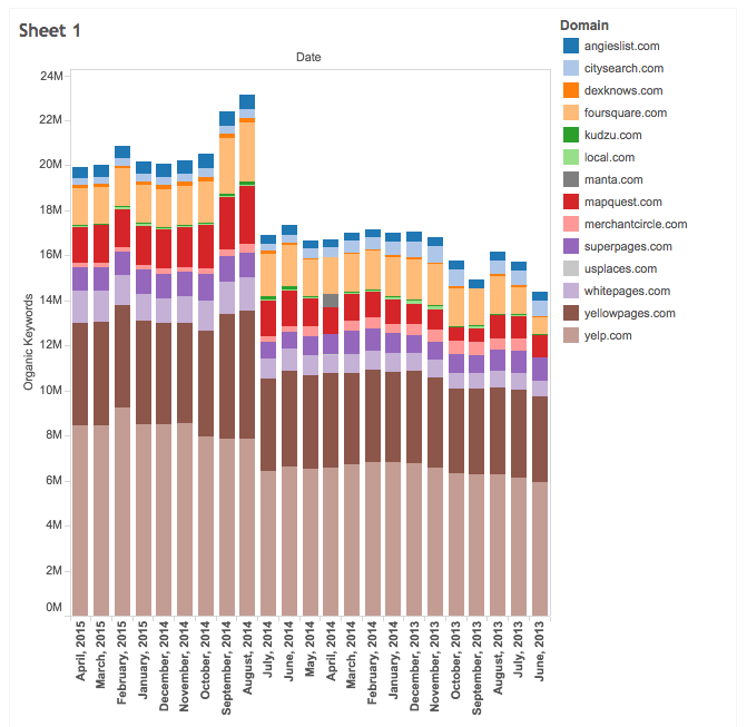
Fourteen local directories were chosen to track based on an article on Vertical Response about top local directories. Websites with local directories as only part of their focus were excluded. Ranking improvement is tracked via number of keyword wins in top 20 position on Google SERP, month to month. There was a very slight improvement for the sites from June 2013 to the Pigeon launch in July, 2014. Pigeon had its most dramatic effect on local directories in the first two months, but the most interesting result here is how steady it’s staying power is to date.
The moving average a few months before the filter was about 16 million keywords. Over the past few months the average was at about 20 million keywords. The websites continue to win very similar numbers for keyword rankings every month. There are many factors effecting keyword wins over time. However, with a steady, clear trend, the amount of “noise” clouding the correlation is very unlikely here.
3. Use Content Overlap Data to Uncover Websites Others Overlook
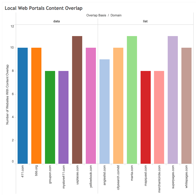
I found my list of local domains from an article on an authoritative website. I wanted domains people would immediately recognize as directories. Alternatively, consider finding industry or niche domains with data research on web websites that have large content overlap to an authoritative list. We are accustomed to researching via imputing one variable and seeing how everything relates.
This is not multivariate, and loses the power of a many to many comparison versus a one to many comparison. If you run a local directory website covering dance clubs nationwide, and you want to understand winning strategies of others in the space, look at the collective properties of the group. Why crunch Excel data for each club’s profile from the SERP in a silo, isolated?
Most tools that look at Google Search big data do not allow bulk search of their data. To get at bulk comparisons, API access usually works best, but it is clearly possible to use data from one by one queries which are combined in a spreadsheet.
In the above graph, the Y axis shows how many of the 14 have similar keyword phrase profiles. To the left under “data” are bbb.com and yellowbook.com, both similar to ten of the 14 in our list. We’ve now “discovered” similar websites in our niche that don’t make most lists.
4. Analyze Content Overlap To Uncover Characteristics of Sector
One result is clear immediately: directories focused on vertices within the local sector have some of the largest overlap. Of the vertices that overlap with our 14 general local directories, most are restaurants (food) and jobs. We go out locally to do work (or find work) and eat more than we go to a dentist, a lawyer, a real estate company, a movie, or an insurance broker.
The overlap comparisons show a common trait: these common websites are portals for users. The national websites are focused on local topics, and visitors often go through them to smaller local websites. True, these sites aim to give you the main facts to answer user local search queries, but they are also portals to visiting websites of the local businesses or organizations. The label “portal” was one of the most important for websites in the Web 1.0 era. Yahoo, the top destination on the web in 2001, was considered a portal. The word inexplicably disappeared, as did many others, from our web 2.0 vernacular.
If we start doing content marketing in a sector we need to look beyond the websites similar to ours and to those that are also similar to others in the sector. Keyword phrase overlap for bbb.com is strikingly similar to the typical profile of sites in our sector. Is it a local directory? Perhaps not, but it is a website we can examine for new ideas about links, subjects to write about, and keywords.
Conclusion
Mobile device usage caused big changes since last July. Watch for effects from Mobilegeddon to push down small local businesses further, giving more traffic to the directories and portals. Local Mom and Pop retail businesses suffer from inadequate budgets for website development and marketing. They couldn’t afford or didn’t prioritize responsive design two years ago, and when they have the budget for a redesign, many will be ill-equipped to understand the Mobilegeddon filter.
Are Mom and Pop businesses doomed to play second fiddle to Google’s own local products listed organically in SERP and to sites like Yelp? That is the picture today, and I’d bet a month’s supply of bird seed it will be true this time next year.
Image Credits
Featured Image: Mclek via Shutterstock
All graphs were created by author for SEJ via Tableau Public.
