


While search engine optimization (SEO) is not an abstract concept, it isn’t exactly easy to depict visually either. That might explain why so many companies fighting for SEO client contracts are trying to simplify the way they explain what they do by way of symbolism. After all, smart companies use easy to recognize fonts and simple graphics and icons for improved branding. Large corporations such as Nike and Apple are obvious examples.
If a company is to prevail, especially in the competitive arena of Internet marketing, it needs to stand out and distinguish itself from others. To use the common SEO verbiage, it needs to be unique and original. The problem is that SEO doesn’t have a clear cut symbol that best represents it, so companies have resorted to utilizing the same ones they’ve seen, using and abusing them to no end. Ostensibly the same symbols are used repeatedly because they best represent the message.
The thing is, when every company uses the same symbols in the same boring way, it doesn’t actually help to distinguish them. Besides, with the current trend of minimalist design and heavy icon use, there’s plenty of room to be creative and avoid cliches instead of, say, writing the letters “SEO” in Google’s logo style.
Perhaps the following wouldn’t be as bad as they are if their design and use were more inspired. To be fair, I’m as guilty of some of these hackneyed styles as anyone, but having recognized the pervasiveness, I’m moving away from these trends.
That said, here is my tongue-in-cheek list of the most overused SEO icons and symbols.

1 .The Jagged Arrow
Whether it’s going up or down, the ubiquitous jagged arrow is there to let you know that this SEO company means business. The arrow going up represents anything you want – as long as it correlates positively with revenue. Its upward trajectory supposedly sends the message that the money this company can make you is high and infinite, or so the symbol implies. On the off occasion where the arrow is on a downward trend, it means you will cut down on anything bad in your business like wasted time, poor production output, and (obviously) declining web traffic. Right. Bonus points are awarded if said arrow is stylized with a 3-d effect, curves up smoothly rather than jaggedly, or narrows at the tail to make it look like it’ll be in motion… forever.

2. The Magnifying Glass
Move over Mr. Holmes, real professionals are on the case. Perhaps nothing screams SEO more than a magnifying glass on a search marketing company’s website. This time-tested detective’s tool is meant to convey the message to fledgling business owners that by hiring this company, their website is sure to be magnified in search results. Runner-up to the magnifying glass is the “person looking through a telescope.”
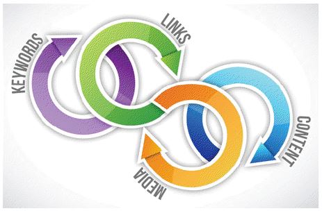
3. The Meaningless Diagram
Far too many SEOs try to make it look as though they are creative by coming up with some overly complicated diagram about how SEO works. Abusing far too many arrows, circular cells, rectangular boxes, convoluted connection lines, and pyramids that really don’t make any sense to anyone who actually knows what they’re doing. The Rube Goldberg diagram is even worse than the other symbols because they frequently bring attention to items that aren’t really important, or are out of sequence.
There is little in the way of SEO symbolism that is more cringe-worthy than that meaningless diagram.

4. The Chart
In attempting to appeal to a prospective client’s analytical abilities, SEO charts depicting a 3-D pie or vertical bar chart with a consistent flow heading upwards is thought to do the trick. To further bring attention to these embarrassing relics of your high school science class and to ensure that consumers don’t miss it, the chart typically comes in either multi-colored form with the primary colors that would make Crayola proud or in a single bright color (e.g., red or yellow).

5. The Bullseye
Spilling into the SEO industry from the broader Internet marketing field, the bullseye is next on the list. SEO bullseyes are frequently all red, perhaps inadvertently making a connection with the logo used by Target (the retail store). Or it could be to benefit from red being exciting and an action-generating color. In any case, there are usually several darts or arrows that are placed dead center for that added effect which emphasizes the message that “our company will hit it dead on every time so hire us!” This one gets brownie points for overuse when the bullseye has a key dead center instead of darts.
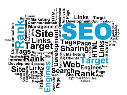
6. The Multi-sized Keyword Cloud
This is what happens when you cross a WordPress tag cloud with a stock photo website illustrator looking to concretize a concept. With multiple words in larger fonts (like SEO, Rank, etc.), you are “sure” to get the prospective customer’s attention!
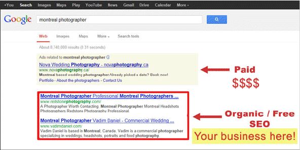
7. The Highlighted Google SERP
Images of Google search engine results pages with arrows and bright colors indicating that “your business could be here” are abundant and tiresome. To be fair, this is the only one listed that actually makes sense to continue using. It clearly depicts a significant part of what an SEO professional tries to achieve. In that respect, the point is well taken. Highlights frequently depict organic rankings as being more important than pay per click ads which are also featured in the graphic. Of course, most people visiting these sites have no clue what industry terms “organic” or “natural” mean, and they probably scare many people away, but that doesn’t restrict their use. Websites that have been updated will add the Google Maps and other universal search features to this mix as well.

8. The 3-D Rendered Character
Whether they are the little round white and grey characters or the tall flat-fronted blue or yellow ones with a touch of depth to them, they always seem to be doing some activity or striking a pose that indicates how SEO will somehow guarantee that you make money. Three dimensional abstract human figures, frequently without facial expressions just don’t cut it anymore.

9. The Globe
Although this is the most overused symbol with respect to all businesses across the planet, the search marketing industry has propelled its use to a new level. This apparent symbol of international client-serving capabilities has been seen in countless formats from flat circles with meridian lines to 3-d versions featuring continents and water along with a shadow or faded mirror reflection under it. This one might be overused simply because there are ample free samples of globes to be found.

10. The Chain
Apparently, nothing clearly explains link building better than a chain. It’s too bad few prospects understand the connection between a metal chain and getting a high position on a search engine results page. For that matter, even fewer understand link building to begin with so this has got to go!

11. The Person Writing Keywords on a Clear Wall
Nothing says SEO more than a person facing you while writing the words “SEO,” “Marketing” and “business” on a clear glass wall. Right? Triple score if the person is blurred out.
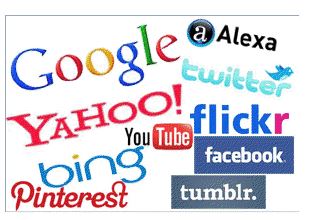
12. The Brand Name Abuser
It’s one thing to post the logos of Google, Yahoo, and Bing, but when brand name logos are used in excess, it’s just too much! Most visitors to your SEO company’s website have no idea what Alexa, Tumblr, PRWeb, Flickr, or countless other websites are. If you want to get clients from the general business community, bombarding them with logos in an unattractive graphic isn’t necessarily the way to do it.

13. The Puzzle Piece
The puzzle piece is an overused symbol of any enigma across different topics. The SEO industry essentially usurped this image. While conceptually the puzzle piece is more relevant than ever given the rapid changes currently underway at Google, it is just too omnipresent to be interesting or unique at this point. Related to puzzle pieces are cubes or blocks that seem to infer children playing more than anything serious or business-like.

14. The Gears
No list of overused SEO symbols would be complete without a mention of the use of gears. It’s not clear exactly what the use of gears even means. Is the symbolism here meant to imply that the SEO company with an image like this sets the gears in motion? In any case, gears appear too often in the SEO world.

15. The Mashup
The single most significant and horrendous example of overuse and being cliche is the combination symbol. It’s not a distinct icon but rather a poorly integrated mashup of several of the above options. While a good or effective SEO symbol would be functional, easy to read, simple to understand, provide instant recognition and convey trust, this combination does the opposite. This is the poor man’s SEO symbol. It’s representative of a mind that not only doesn’t know the basics of online marketing, but fails to understand what a prospective client needs to see. The result is an amateur mess of graphics that can rarely be taken seriously. In the end, if you come across a company that uses these combinations to excess, it’s probably not the one you want to hire.
